Target Pride
Role: Digital Art Director & Designer
Project Brief
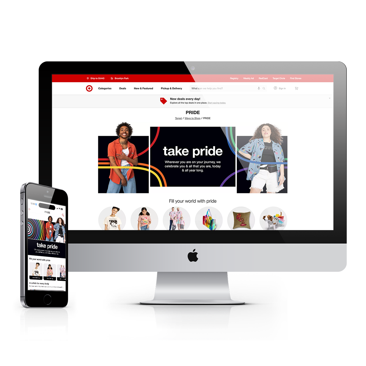
Show up authentically for the LGBTQIA+ guest through bold product, inclusive campaigns, and everyday affirmation that authentically represents, creates inclusion, and celebrates the LGBTQIA+ community and culture. Drive digital program sales by increasing engagement measured by YoY click-through-rate and conversion, and promoting ease of shoppability on all platforms. Support merchandise priority objectives throughout funnel. Create an affirming & welcoming space for all, that celebrates the beauty/diversity of love & living beyond the rainbow. Modular, scalable page designs.
Key Results
KPIs: Unique visits and demand were up over 55% YoY.
Physical + Digital connection: QR codes saw strong engagement in stores: 28K total scans, converting at 2.7%.
Total Pride: $38.3M in sales, +81% to LY.
Front of Store: $28.4M in sales, +77% to LY.
Project Experience
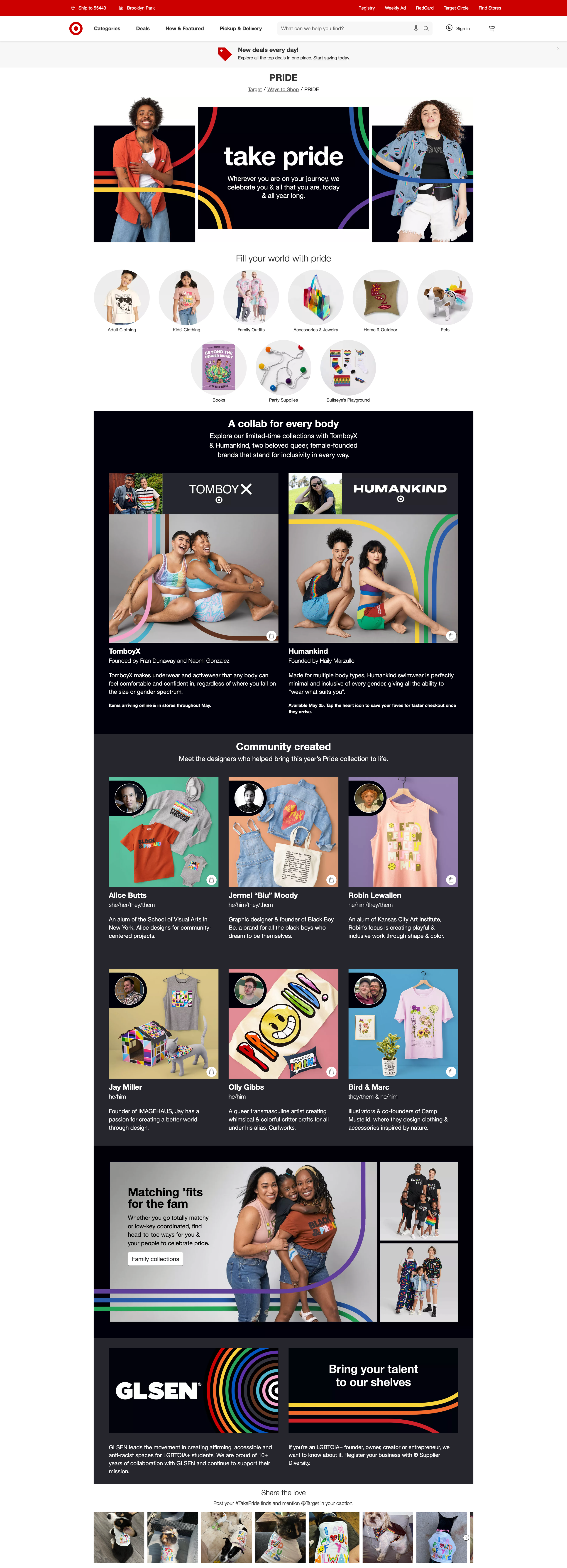
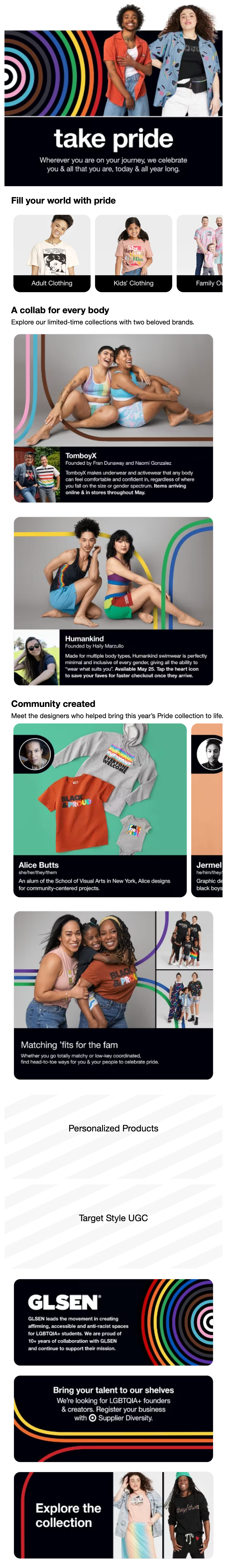
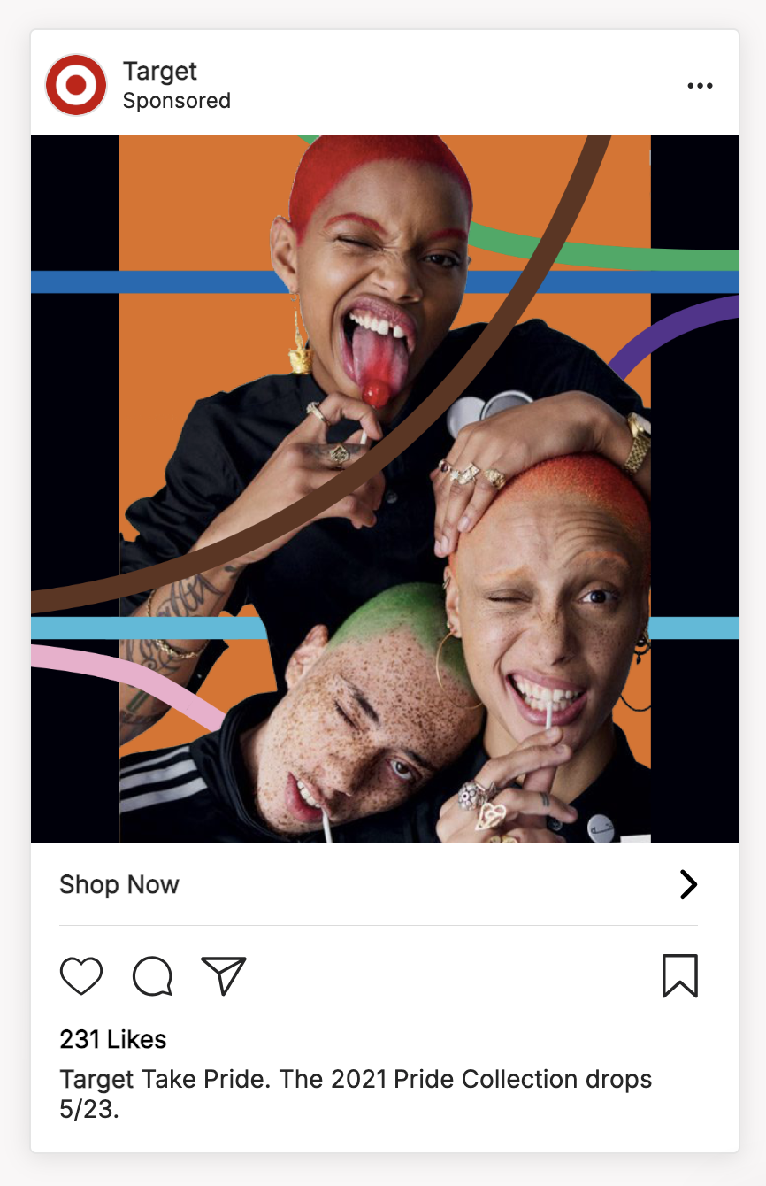
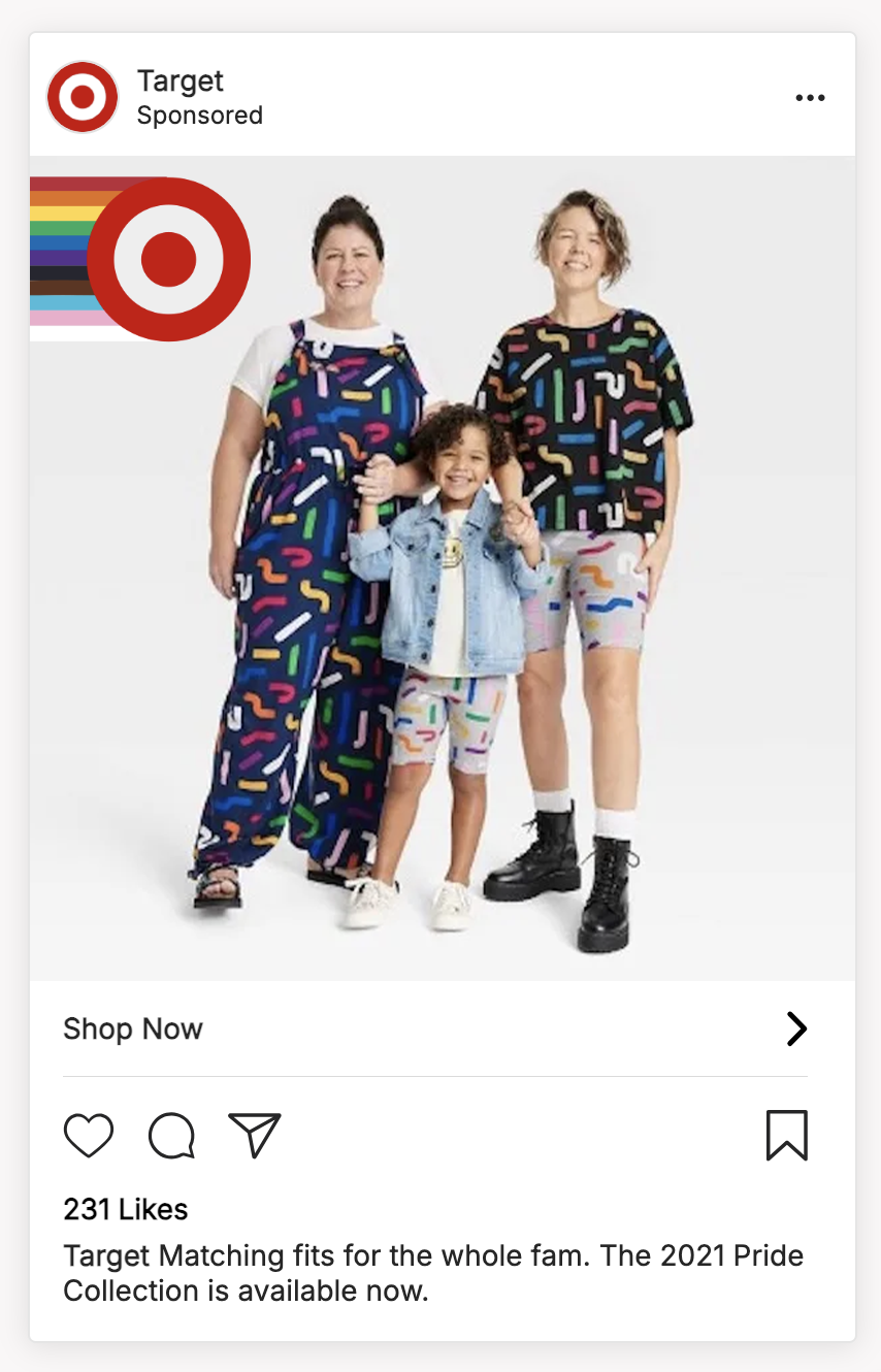
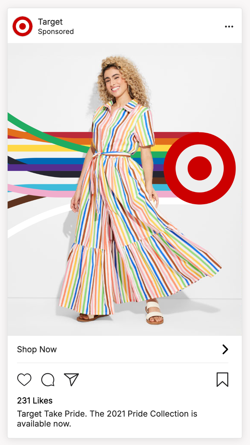
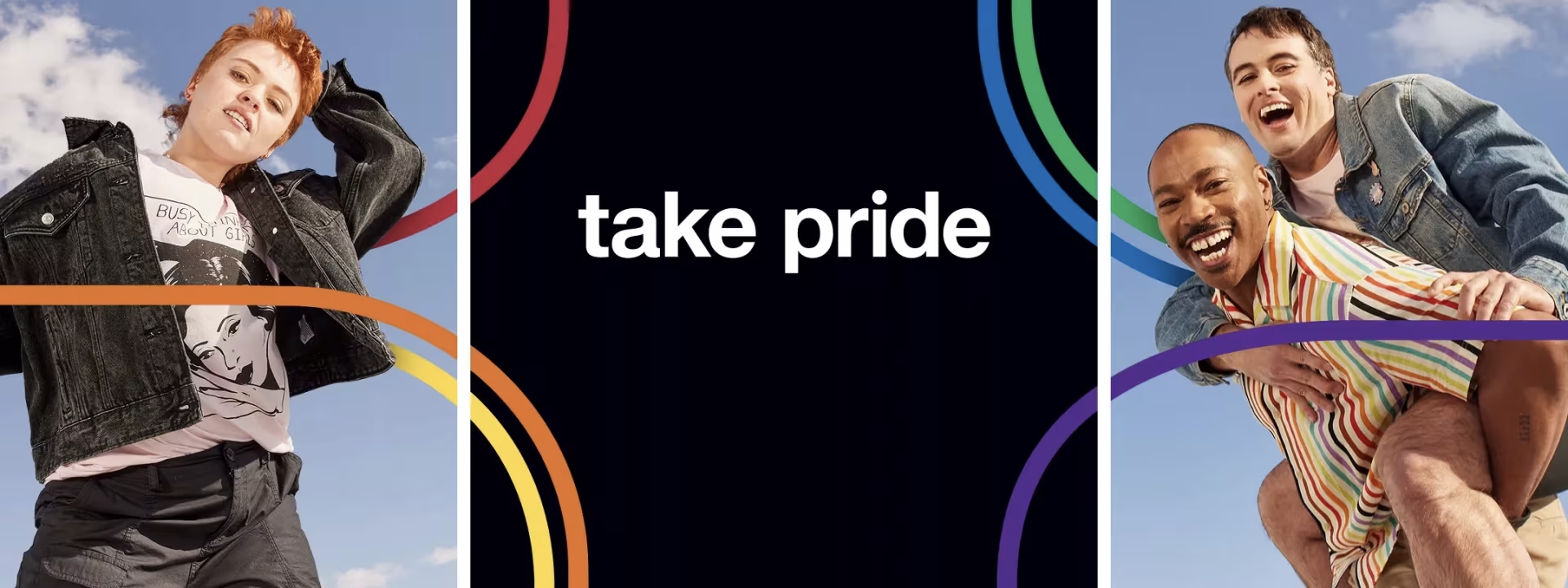
In February of 2021, I was asked to join the Pride team as the digital art director and designer for the dotcom experience and photoshoot, key aspects of the Pride merchandise campaign. This was the first year Target really went all in on their Pride collection, creating a visual identity and an impactful pop culture presence by collaborating with beloved LGBTQIA+ artists and charities.
This kicked off a short 3-month fray of brain storms, wireframing, casting, styling, photoshoot pre-pro, art directing, retouching, creating visual guidelines, designing, presentation meetings, feedback, approvals—all of the intertwining steps needed to reach the finish line at break-neck pace.
While I was at the forefront of the dotcom experience and photoshoot, it still took a pretty big, extremely talented team to make this entire campaign come to life across many channels. Project managers, designers, ADs, CDs, site merchandisers, marketing teams, copywriters, UX designers, social media managers, etc. I made so many great connections with colleagues when we were in the late-night, non-stop collaborative trenches. While the deadline was stressful at times, the work was fun, which really shines through in the final product; it was punchy, loud, and unapologetic.
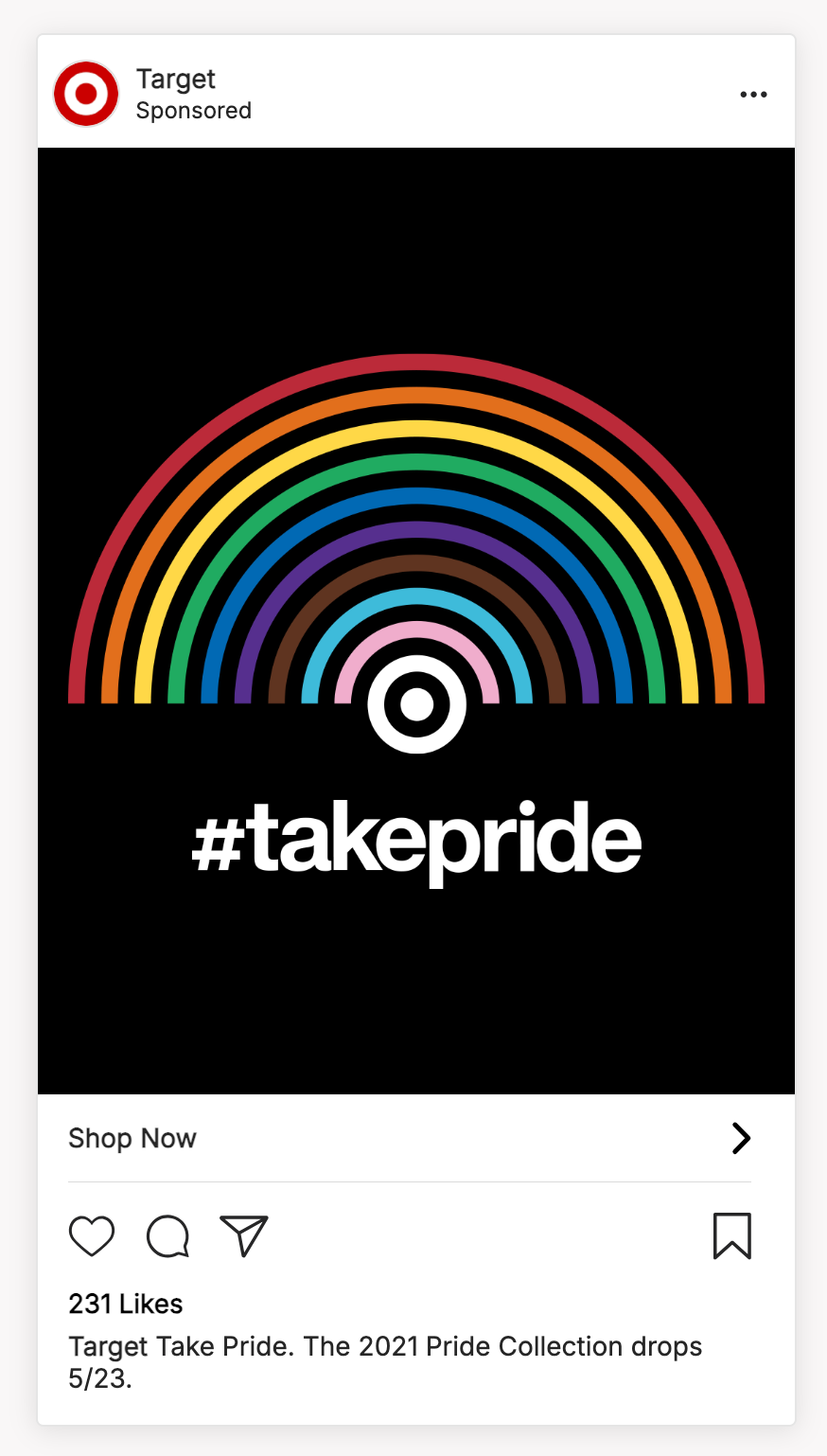
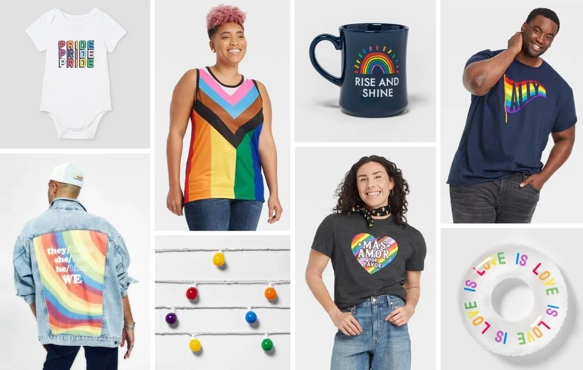
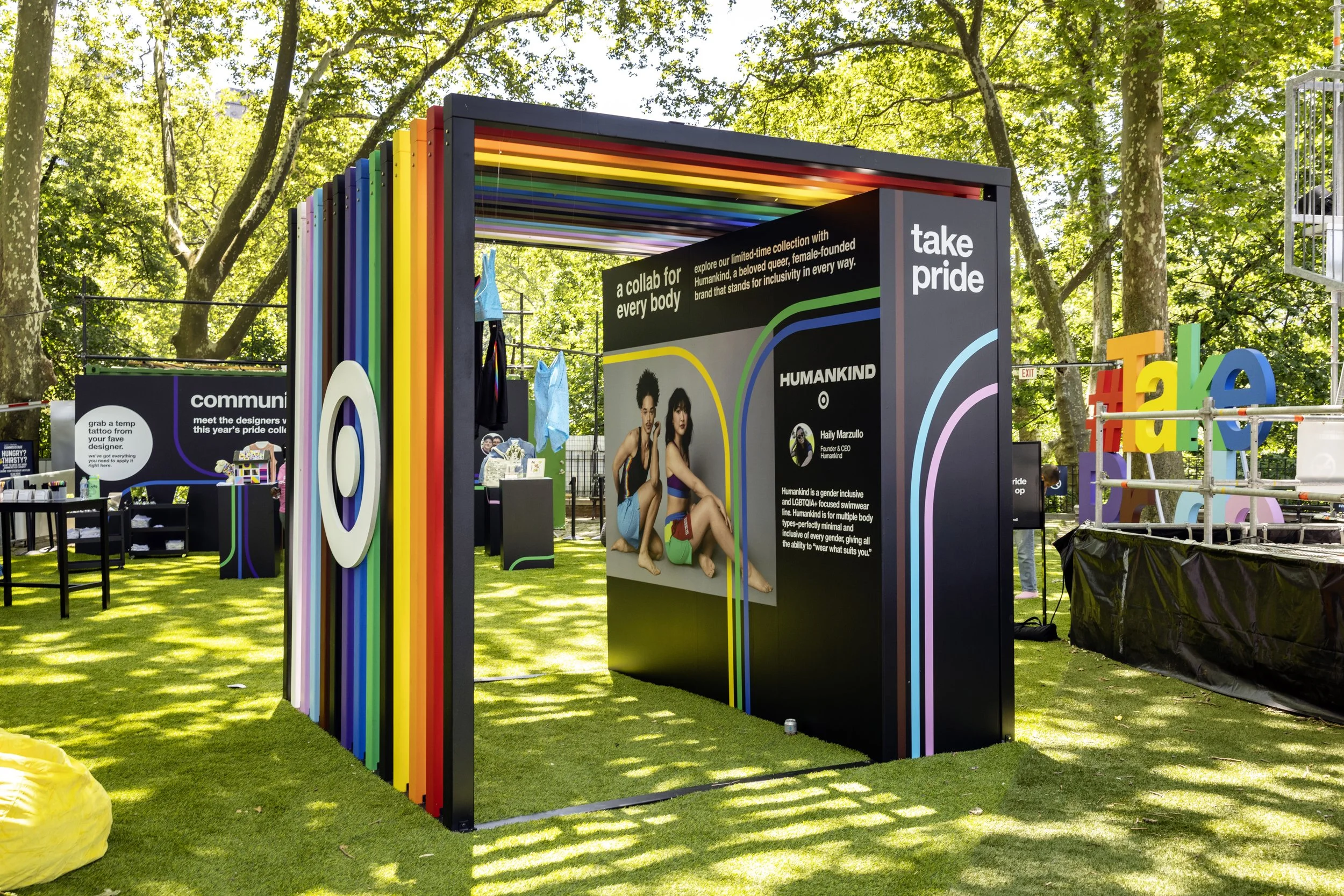
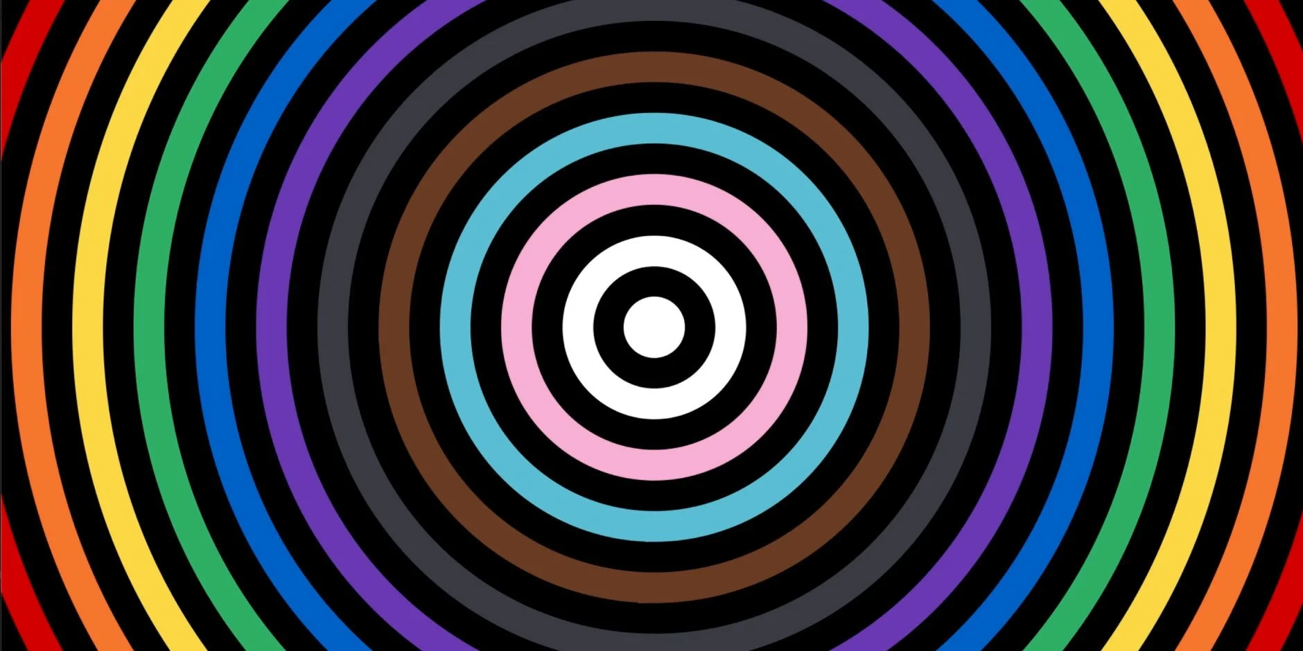
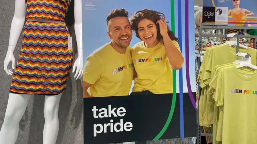
The visual guidelines I established for the dotcom experience helped other designers create additional assets across social media, in-store displays, event spaces, video, product photography, and much more. Bold, playful lines weaving between stark black backgrounds and hero images, tight crops, authentic models, and an overall strong, confident presence.