Target Father’s Day 2025
Role: Designer
Project Brief
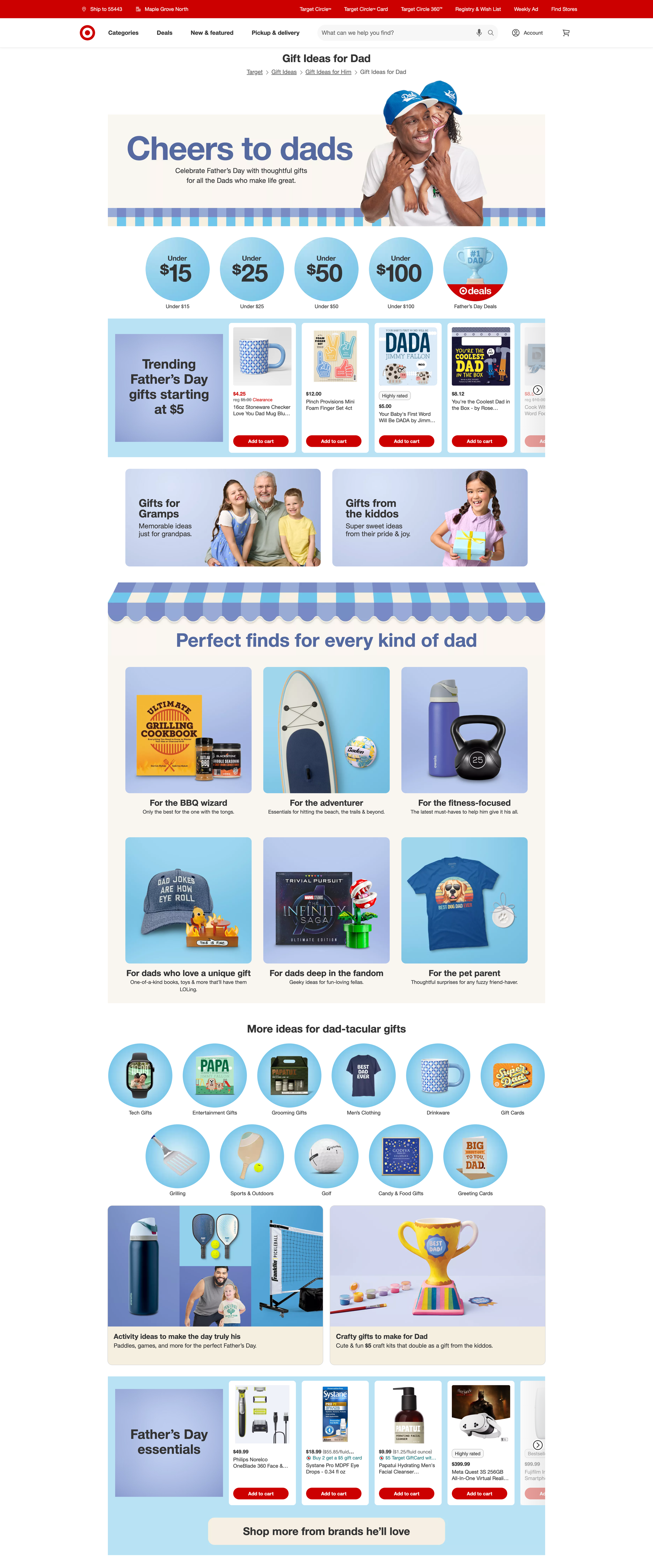
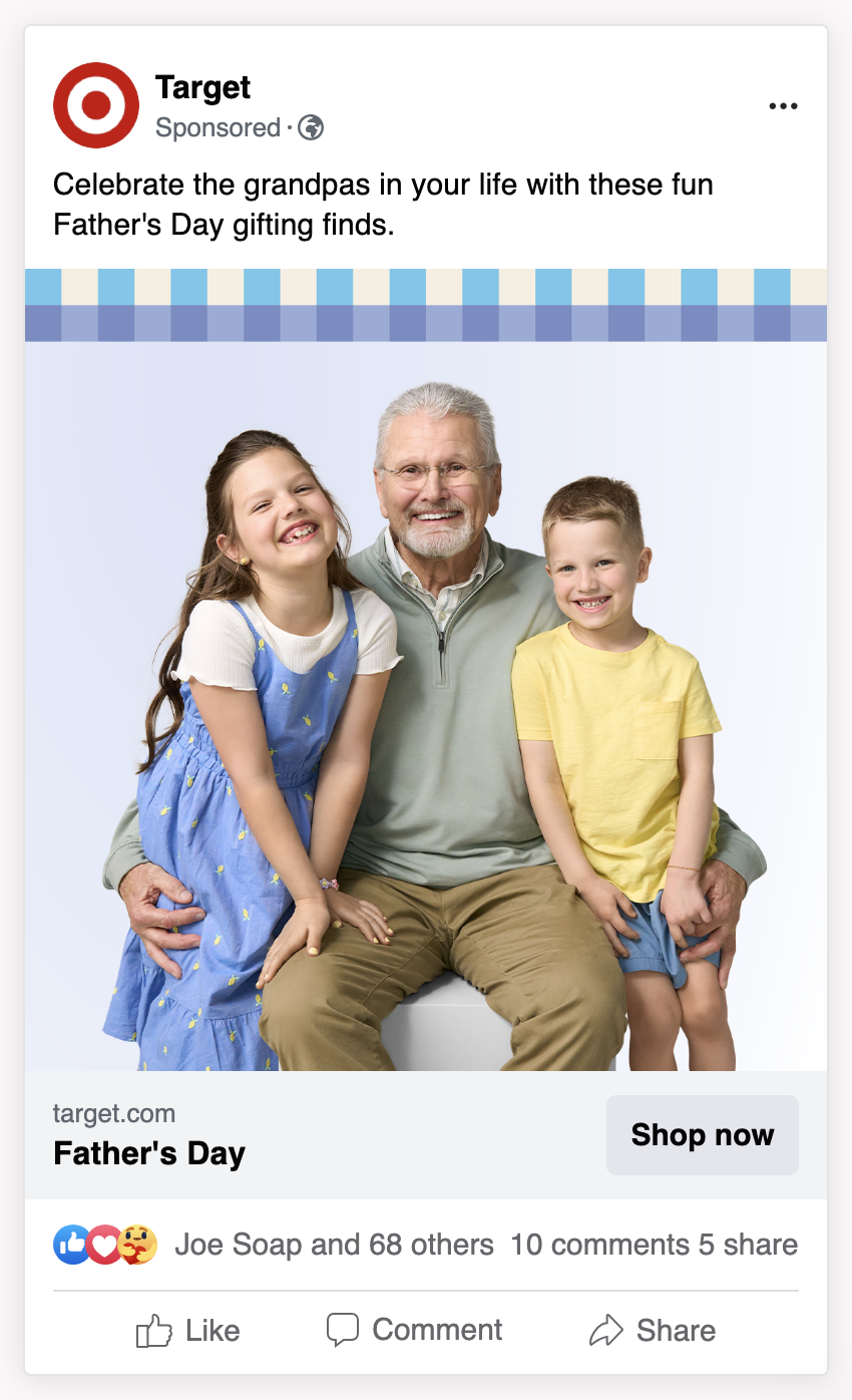
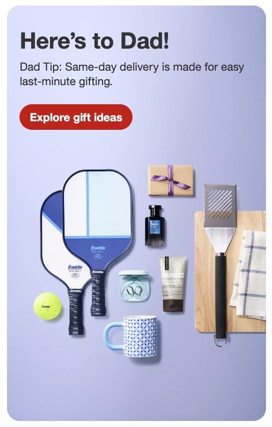
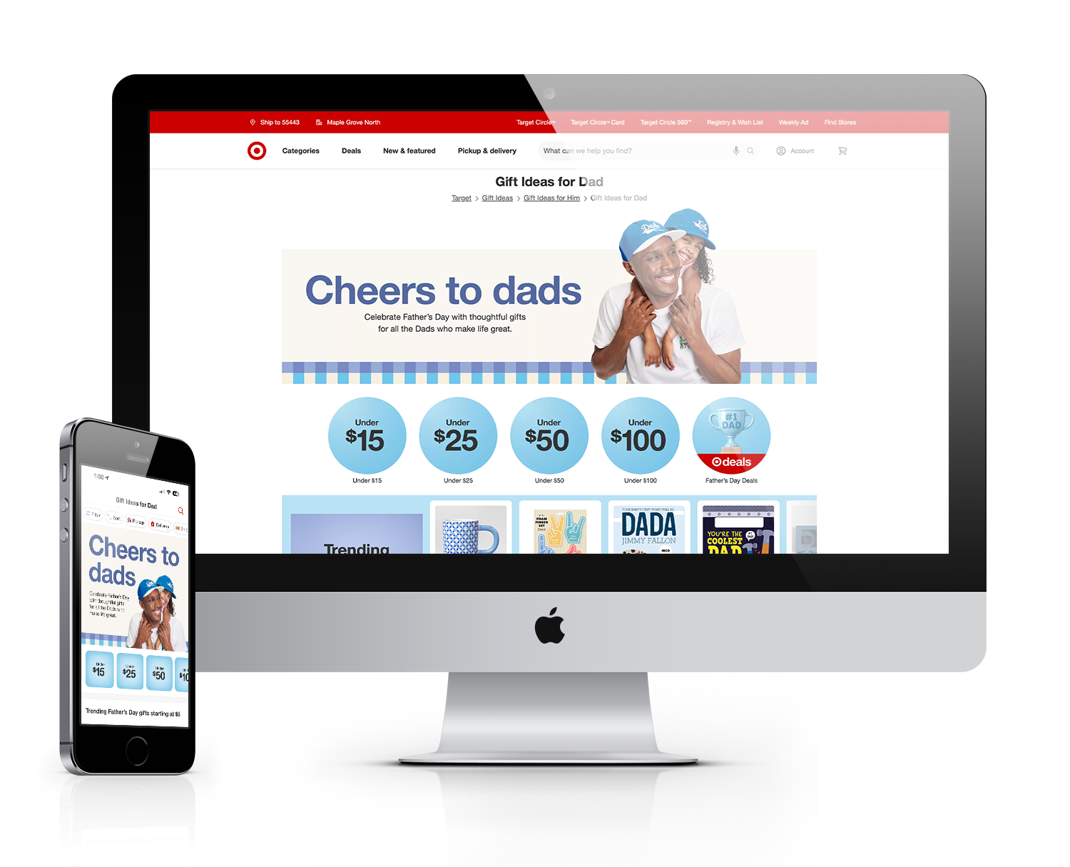
The Father’s Day hub should be easy to navigate, inspirational and reactive with trending items and stories. Focus on recipients, interests, and value. Copy should speak to finding the perfect gift for dad. Top keywords during this time to look at including in the copy are “meaningful” and “thoughtful”. Possibly speak to grandpa as well, as this will be a callout in the hub. Focus should be on products.
Key Results
Visits: 2.7m, +2% YoY
Demand: $24.8m, +8% YoY
Conversion: 11.52%, +11.84% YoY
Exit Rate: -3% YoY
Project Experience
Occasionally while I worked at Target, I’d be asked if I can help another team with their work when they’re past their bandwidth. Target’s 2025 Father’s Day “hub”, or landing page, was one of those instances. The senior art director provided me with all the Father’s Day creative assets I would need, and the site merchandisers gave me the already fleshed out product priority, page hierarchy, and site architecture.
My role was to then collaborate with the team’s copywriter to make the visuals and copy as fun and inspiring as possible. A few rounds of internal reviews with leadership, partners, and stakeholders later, and we had an exciting Father’s Day dotcom experience for the guest within just a few weeks.
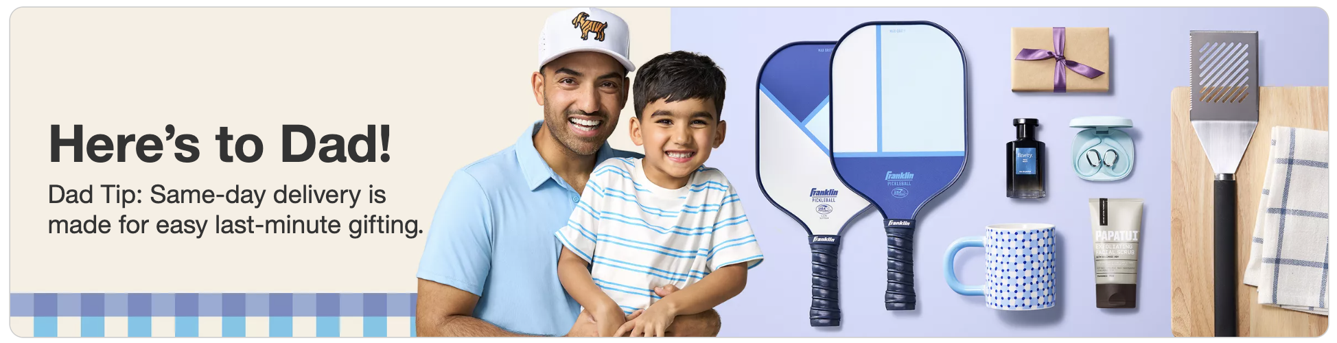
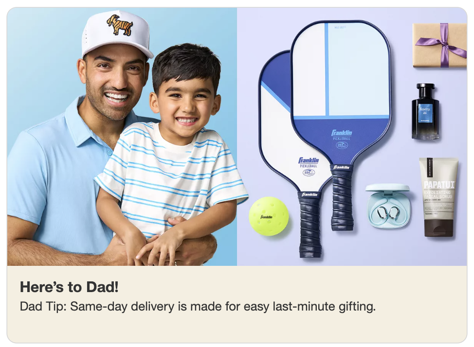
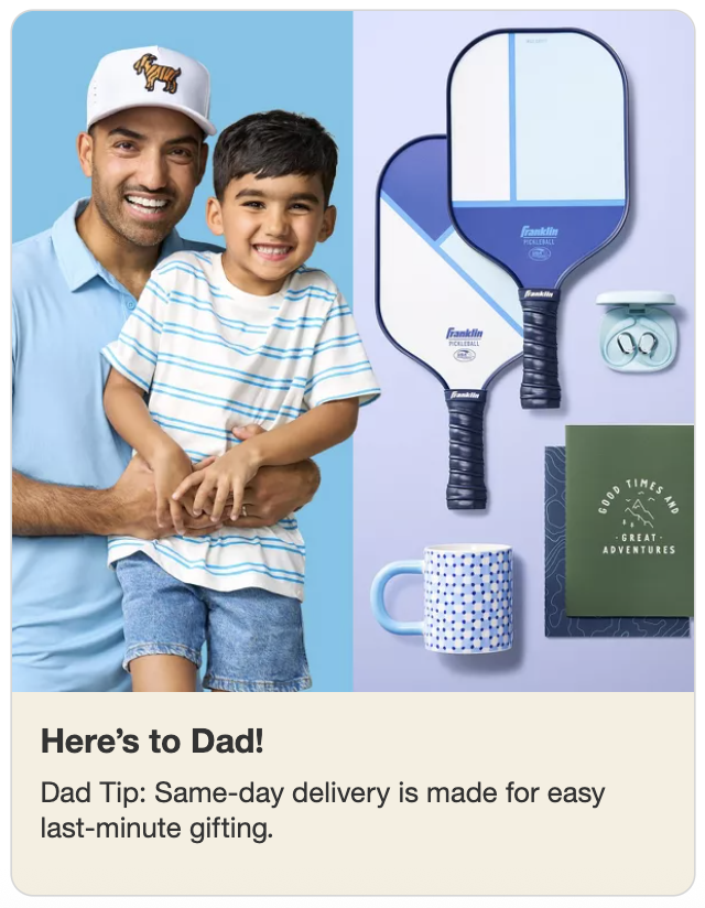
This page launched right after Mother’s Day on 5/11/25, and each week leading up to Father’s Day on 6/15/25, we had a series of page adjustments. These adjustments were based on guest interaction findings, and I kept the design very modular so that moving certain components further up or further down the page was easy depending on importance, timing, and messaging. The closer we got to Father’s Day itself, the more we leaned into deals, quick shipping or store pick-up, and last-minute language.